GUILDFORD HIGH SCHOOL
Celebrating the year in style
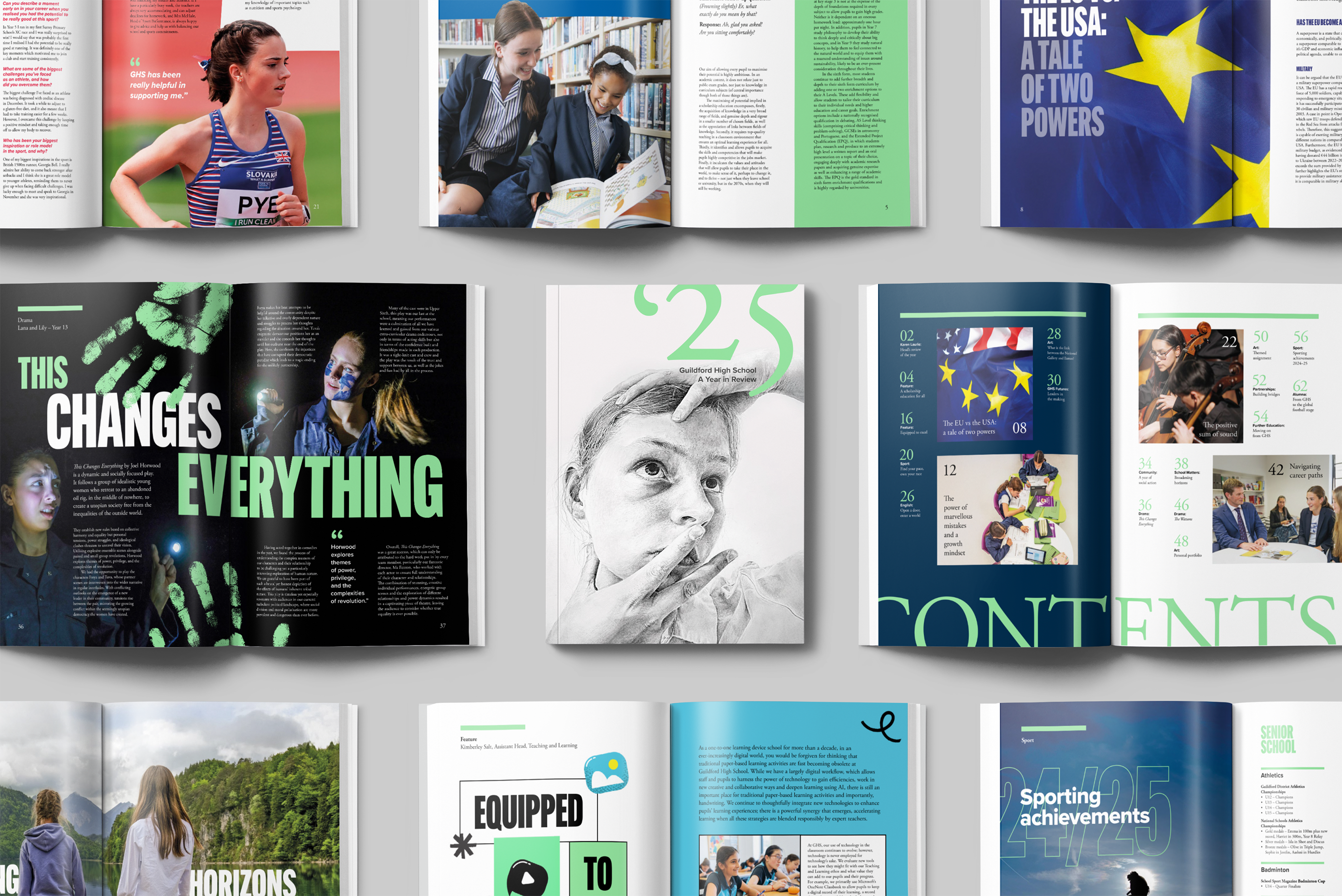
Guildford High School is one of the UK’s leading independent girls’ schools, named Independent School of the Year in 2024 by The Sunday Times. Rather than sticking with a traditional prospectus, the team wanted a publication that sparked the imagination and truly celebrated the school’s achievements.
What we delivered
— Literature
— Publishing
— Illustration
Smart Thinking
Stepping outside the brand guidelines gave us the freedom to be more inventive, playful and expressive.
Beautiful Design
Eclectic designs held together by a solid grid and made tactile with beautiful print.
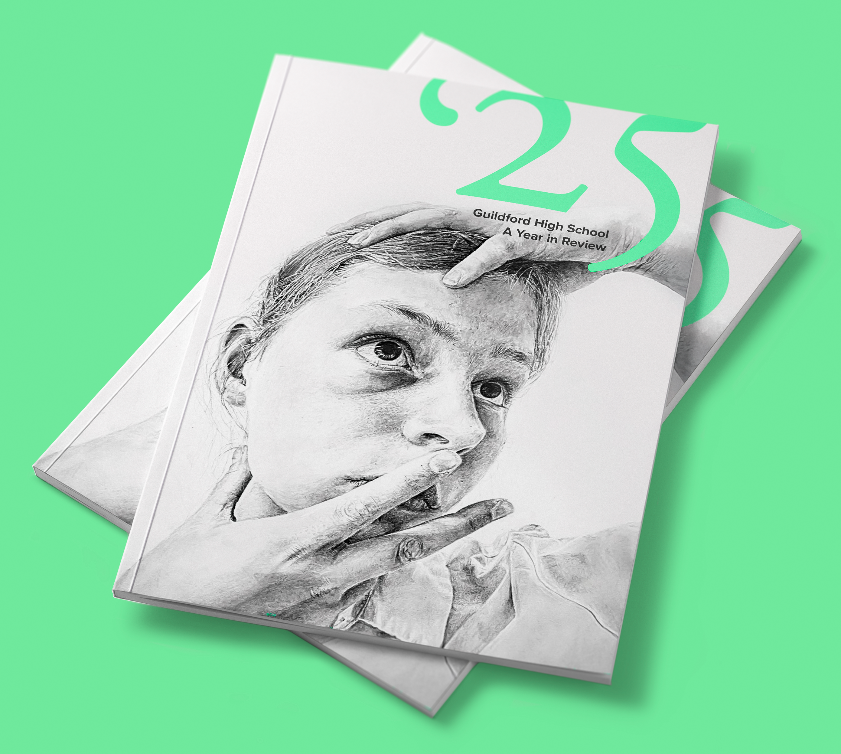
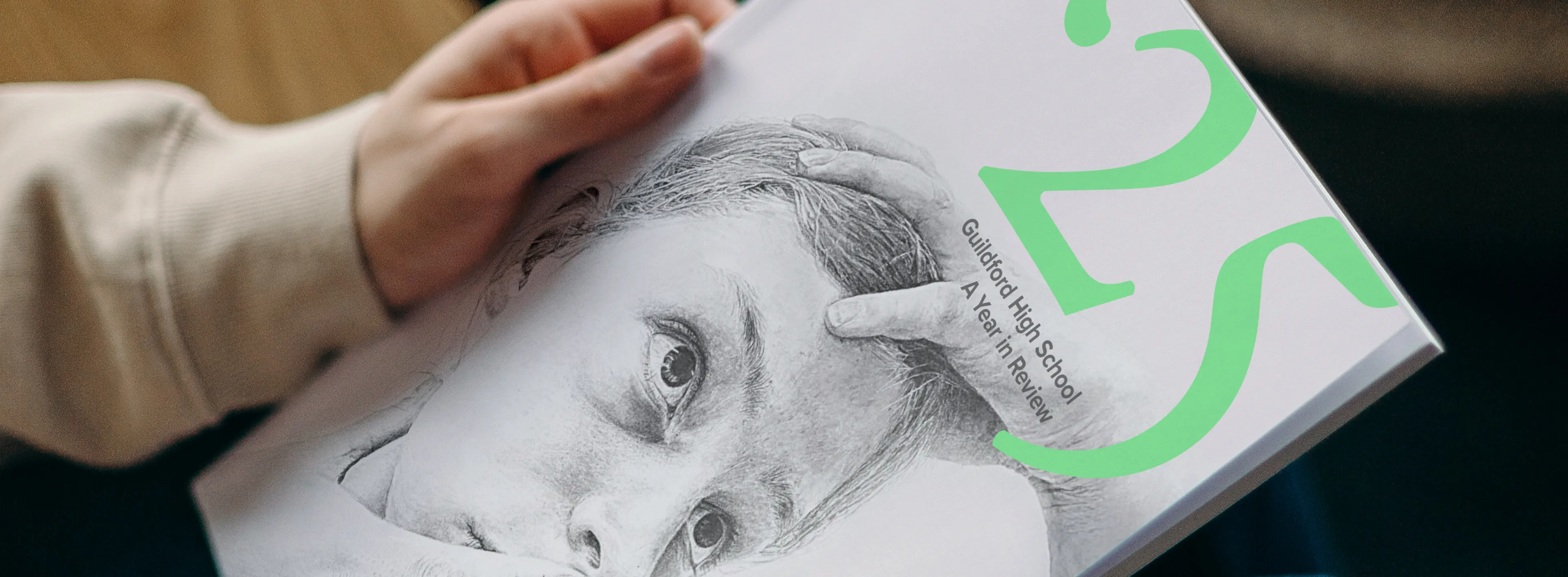
THE BRIEF
The goal was to create a standout publication that celebrated the school’s achievements over the last year. As well as acknowledging the work of students, teachers and alumni, the design needed to feel forward-looking and inspiring, combining engaging design with beautiful print.
EDITORIAL FOCUS
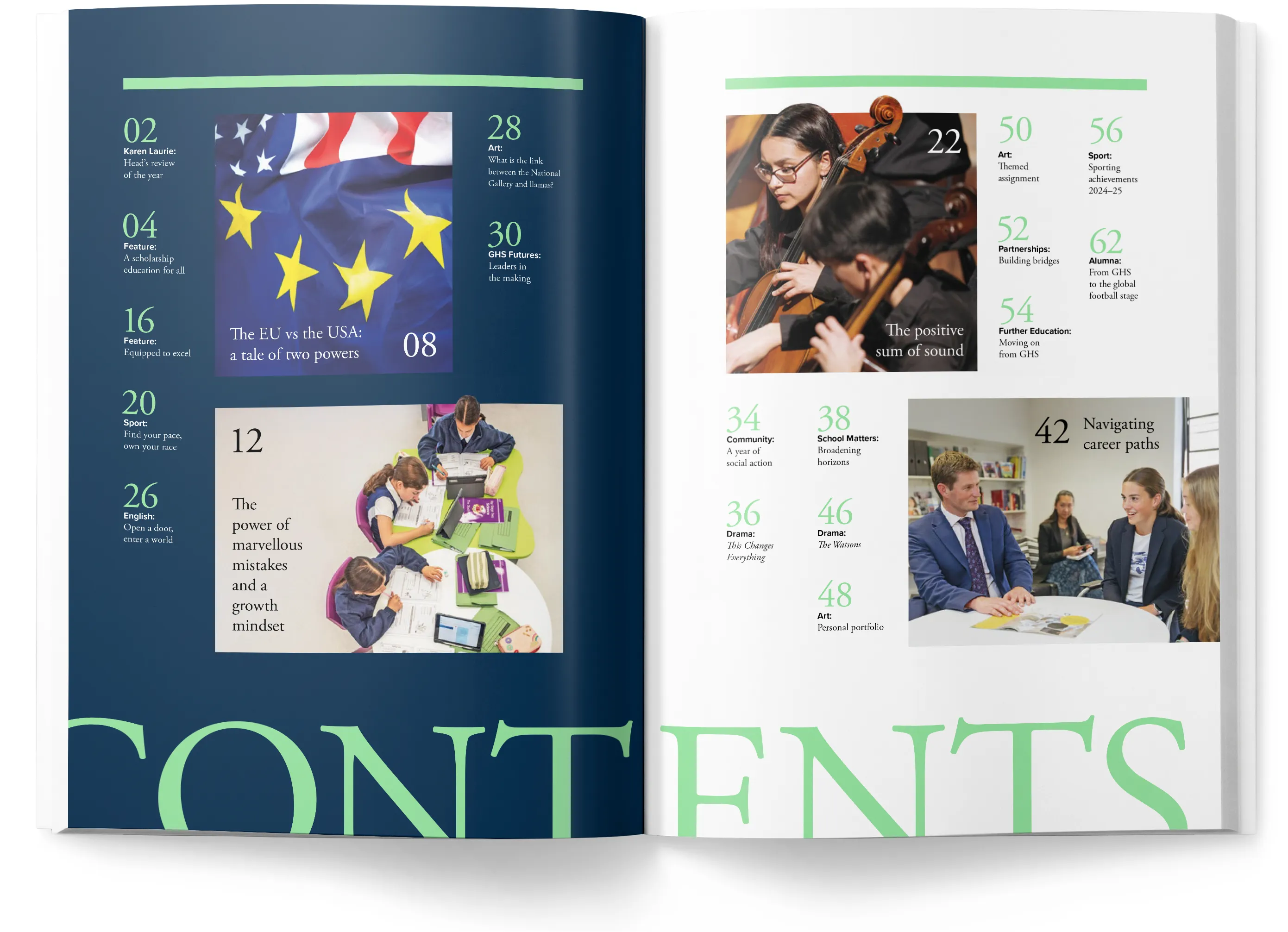
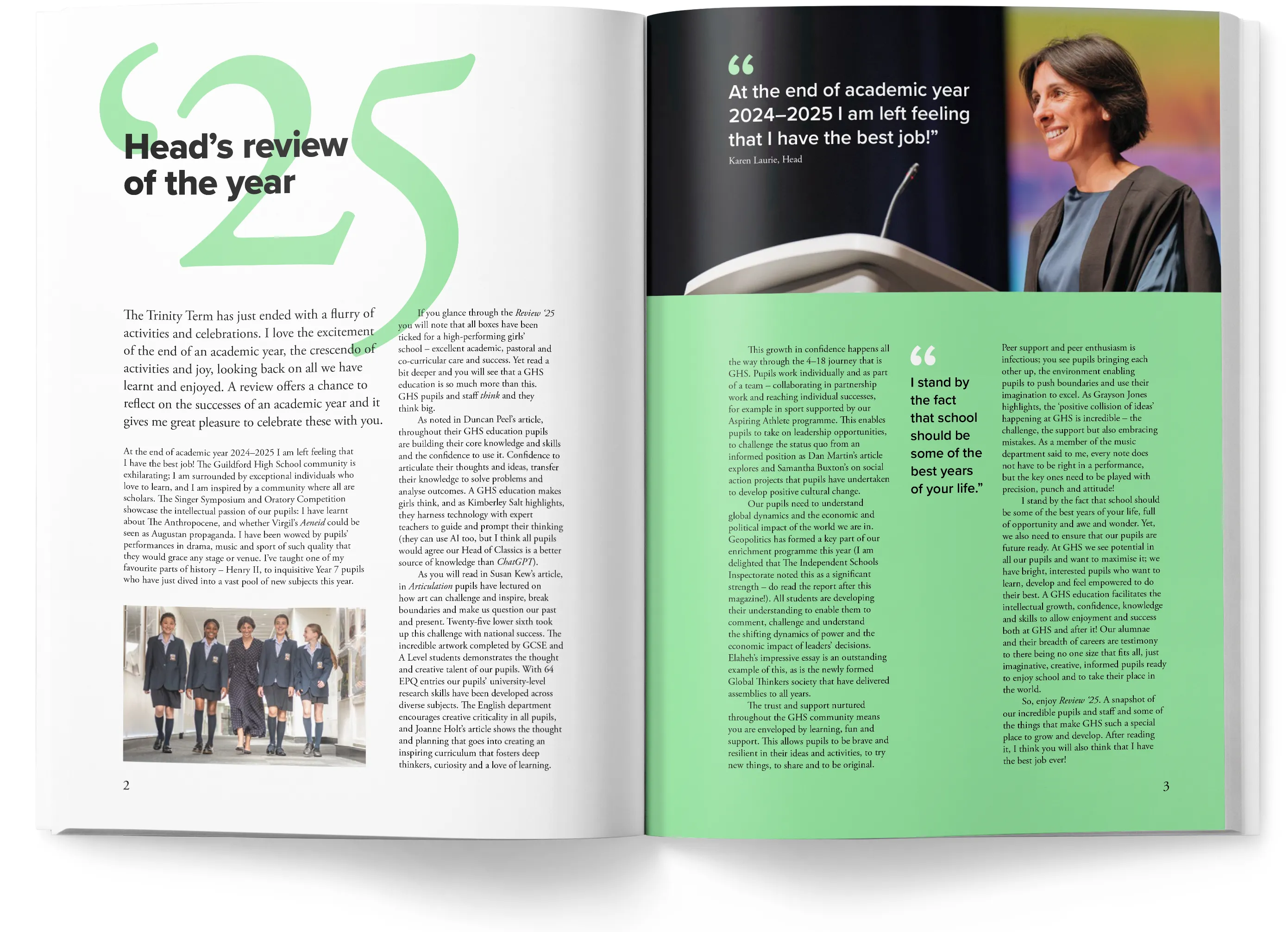
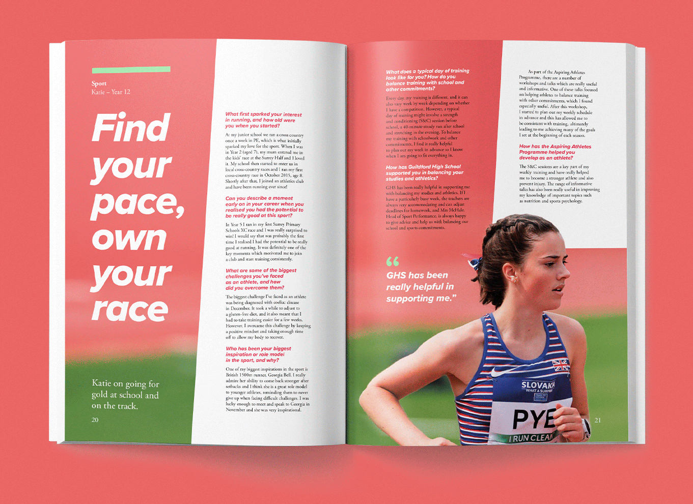
Working together with the editorial team, we grouped content into key sections, each with its own tone and visual style. A strict baseline grid kept everything consistent and easy to read, allowing us to be more experimental and creative with the layouts. We pushed the School’s approved typefaces to their limits and introduced a condensed headline font for more variety.
TACTILE PRINT
We worked closely with the communications team to get the print and paper spec right. A bright uncoated stock gave the right tactile quality while still holding colour and imagery well. A fifth Pantone colour was added to tie the publication together visually, and a clear foil was added to the cover for added standout.