THE Y THEATRE
Rebranding an iconic venue
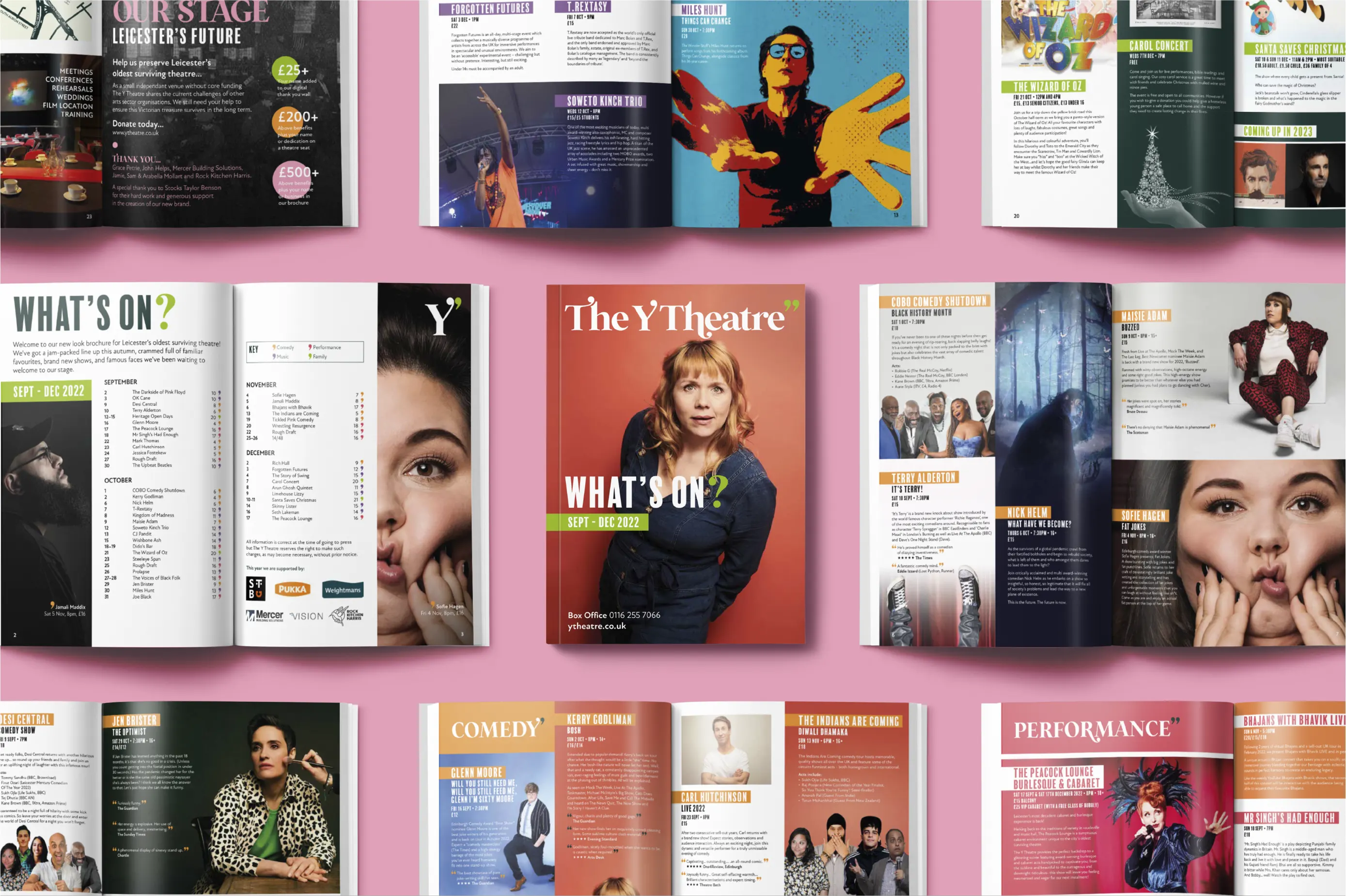
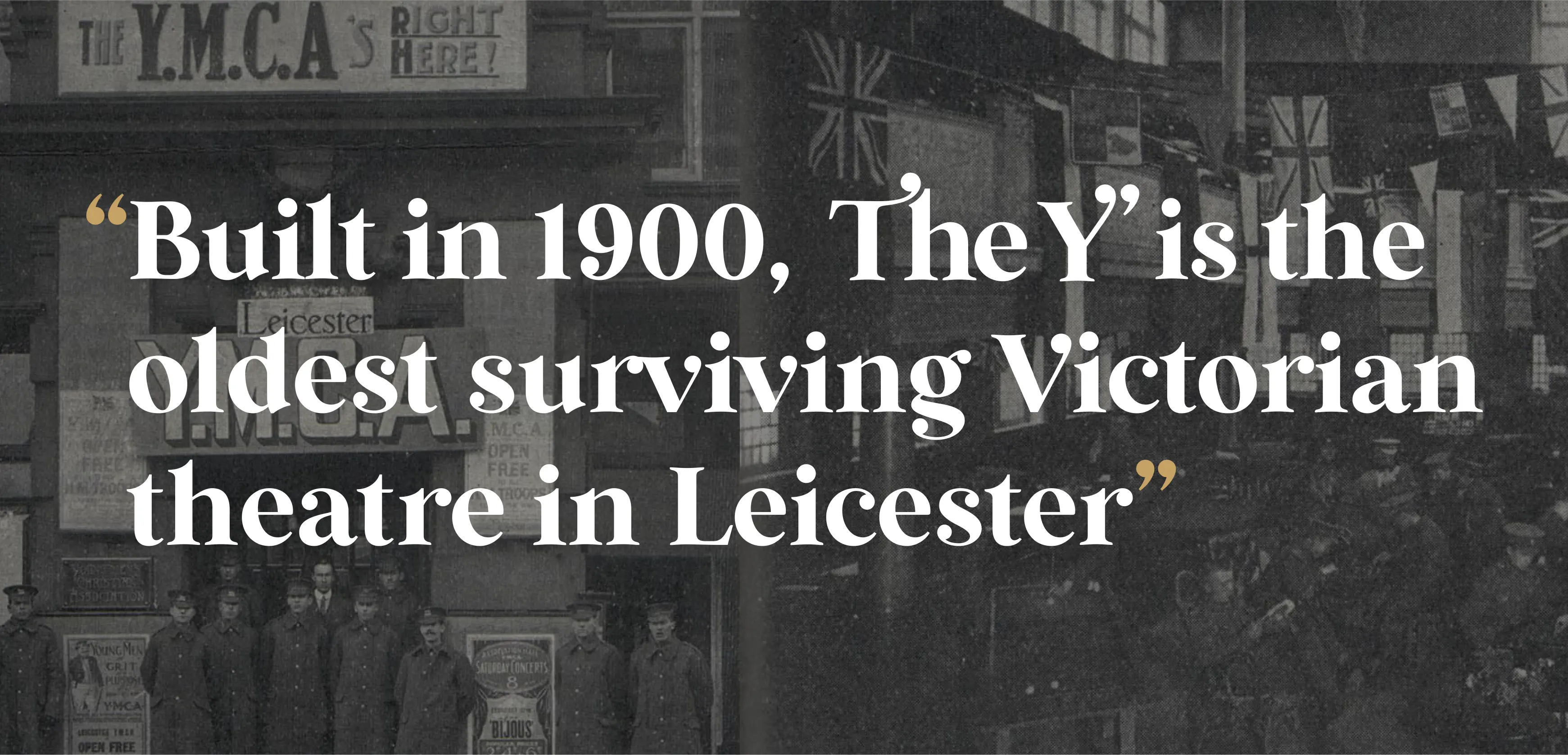
We were asked to rebrand The Y Theatre – Leicester’s oldest surviving Victorian venue of its kind. Next door to its parent organisation, the YMCA, it’s a cosy, intimate and welcoming place with no stuffy airs and graces. A place where punters can get up close and personal to well-known and upcoming artists, comedians and musicians.
What we delivered
— Brand Identity
— Social Media
— Animation
— Brand Collateral
— Guidelines
— Copywriting
Smart Thinking
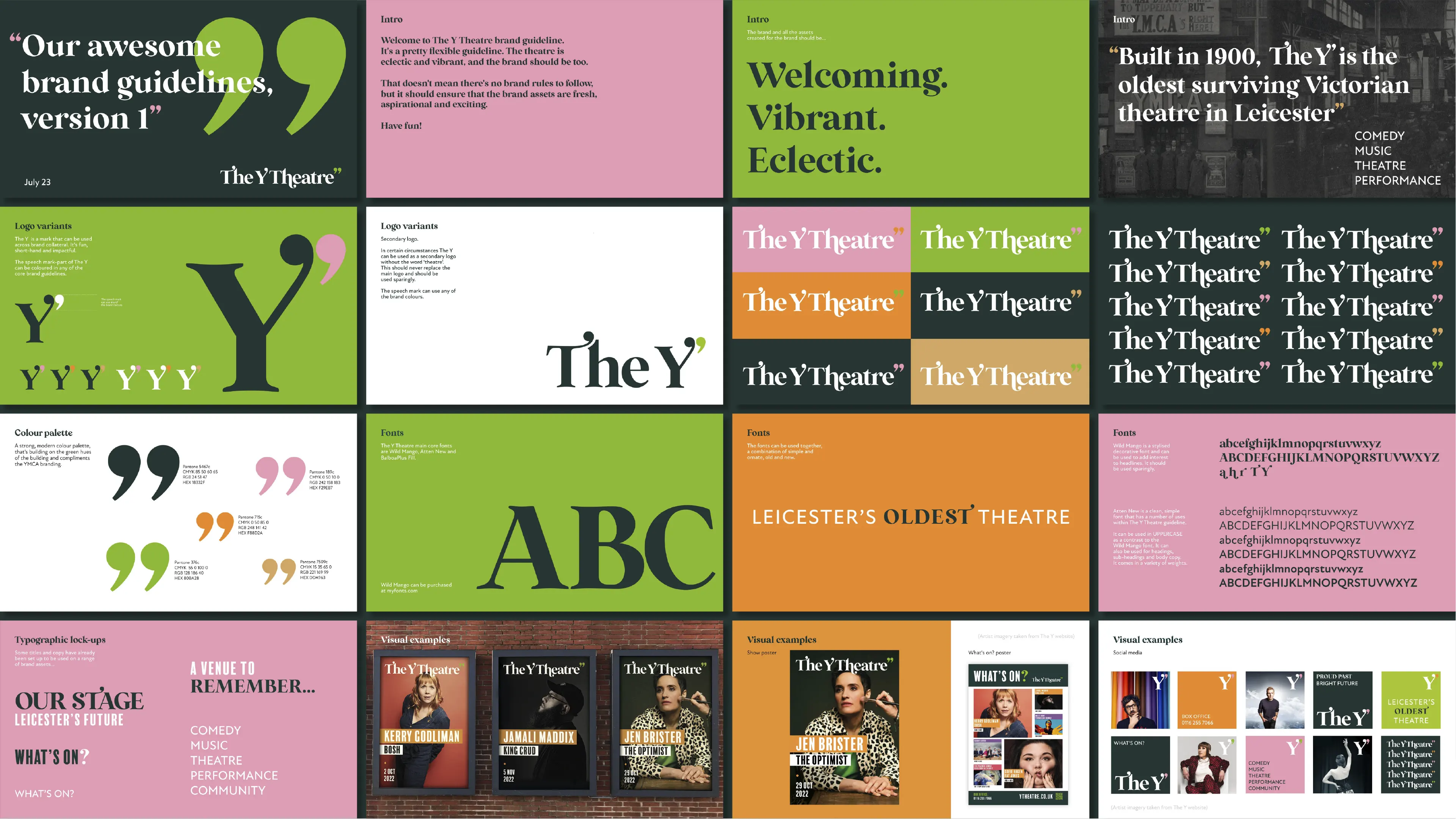
Capturing the theatre’s unique character by balancing its Victorian heritage with a fresh, contemporary voice.
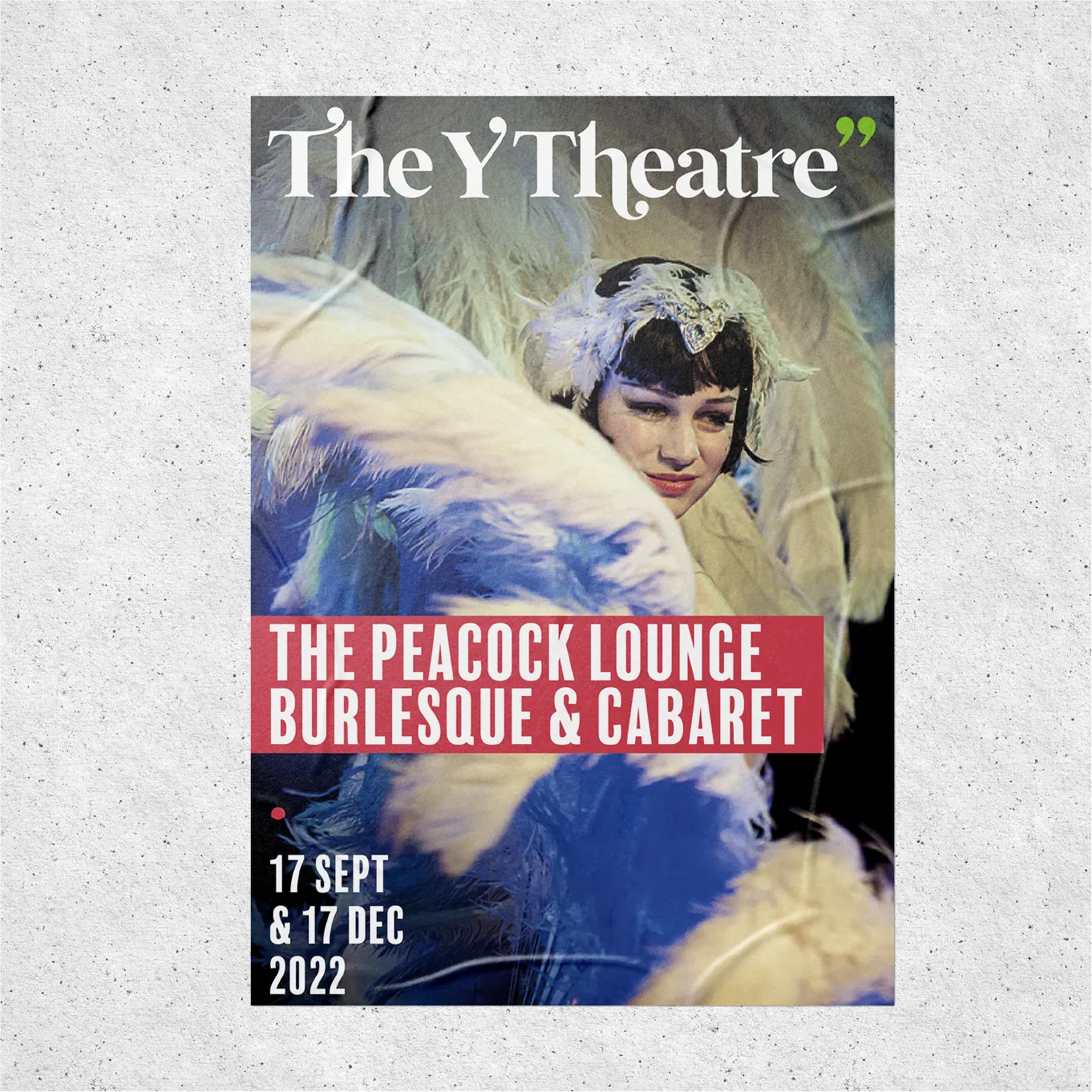
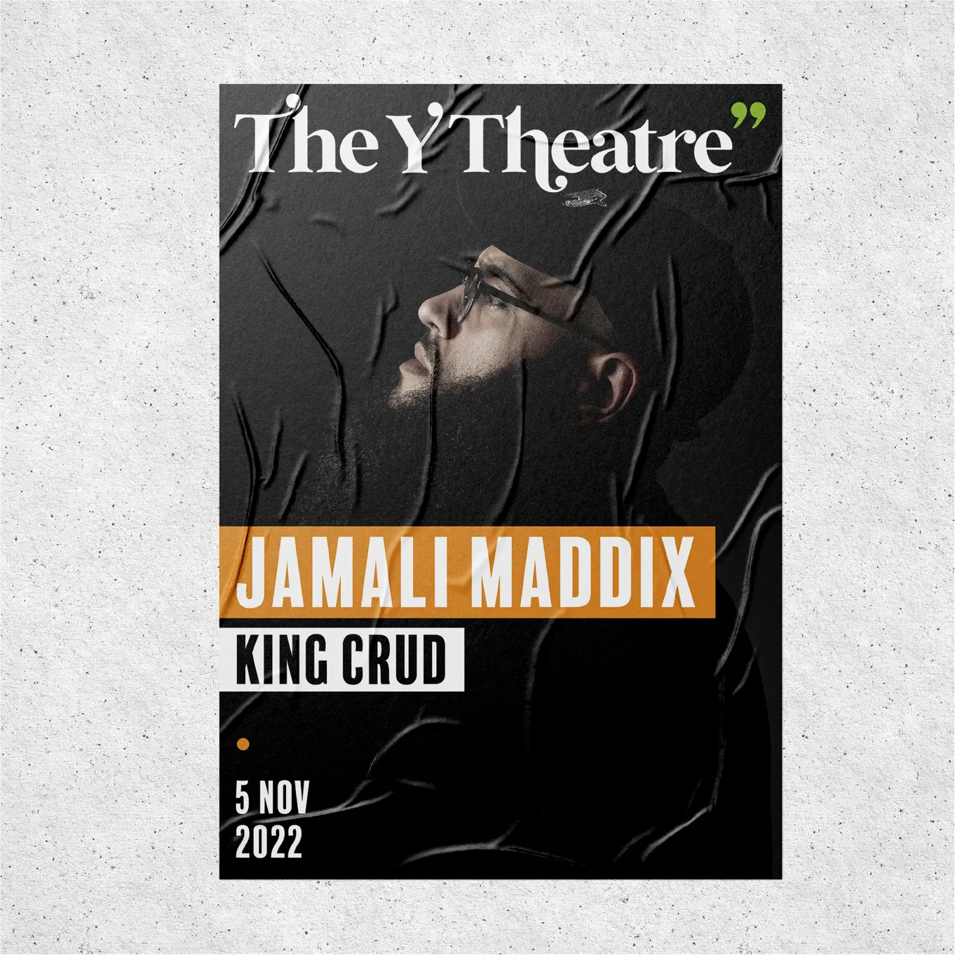
Bums-on-seats Design
A playful but expertly crafted identity inspired by the building’s decorative details, bringing bags of charm and personality.
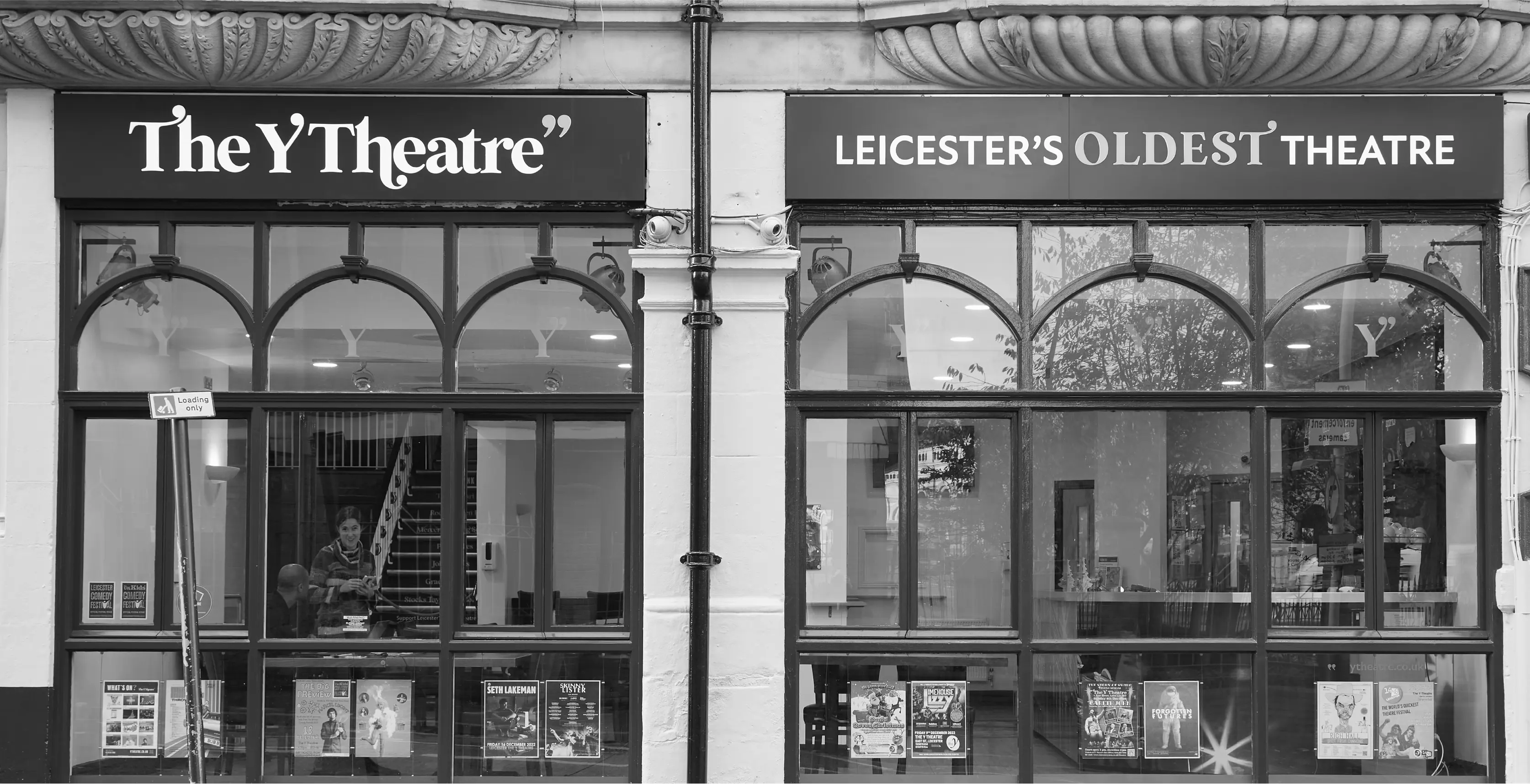
THE IDEA
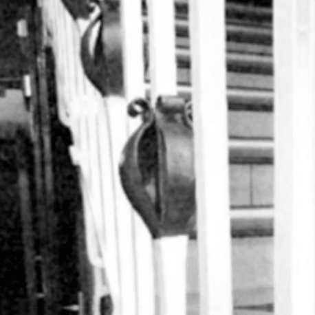
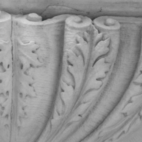
The concept drew directly from the building’s distinctive architecture. The logotype takes cues from the decorative elements found throughout the venue, from ornate banisters to carved stone scrollwork. Distinctive finials on the ‘T’, ‘Y’ and ‘h’ echo these architectural details, while a speech-mark device appeared throughout the identity, adding a playful flourish that comes to life in animated applications.
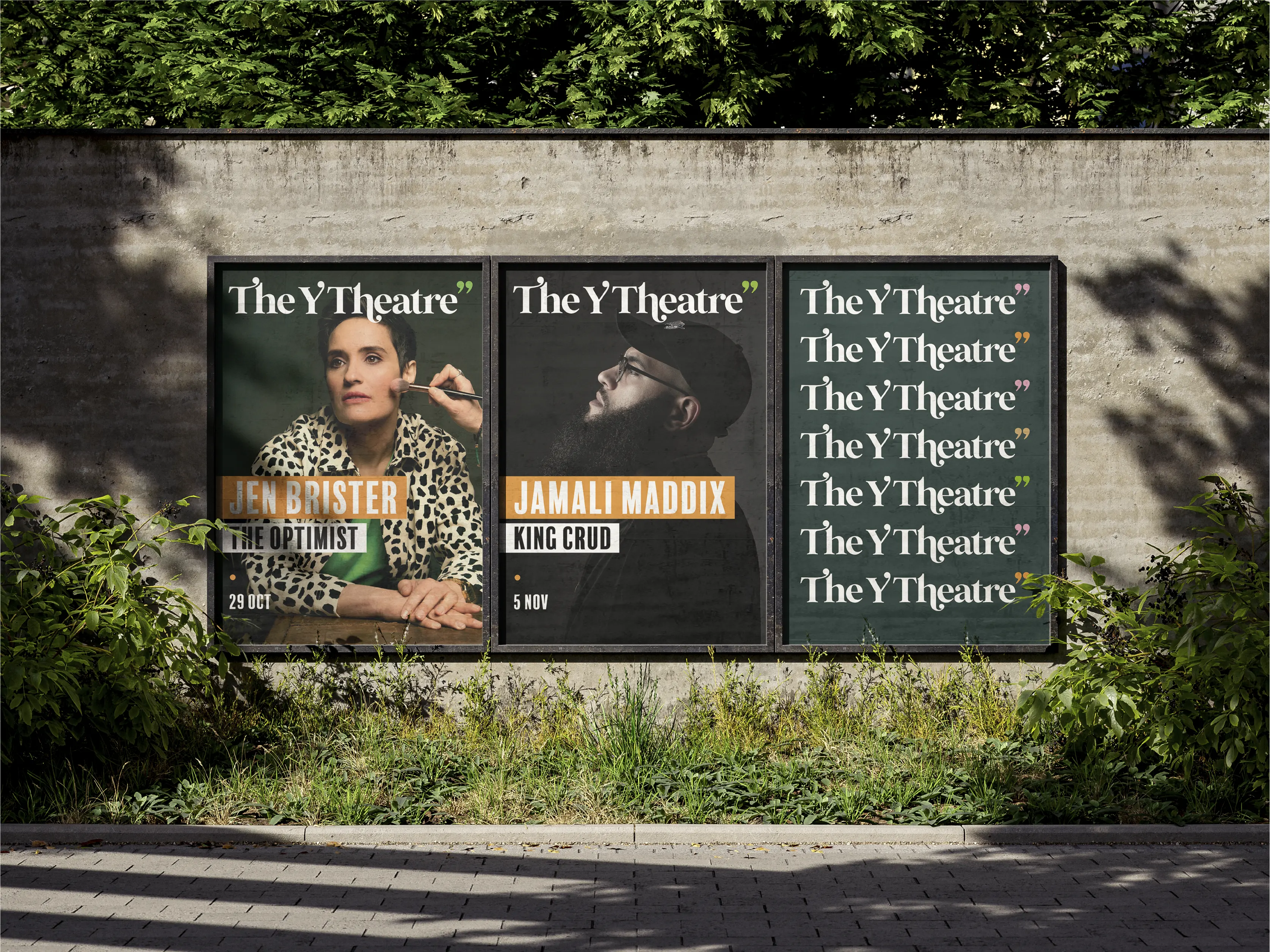
FLEXIBLE PALETTE
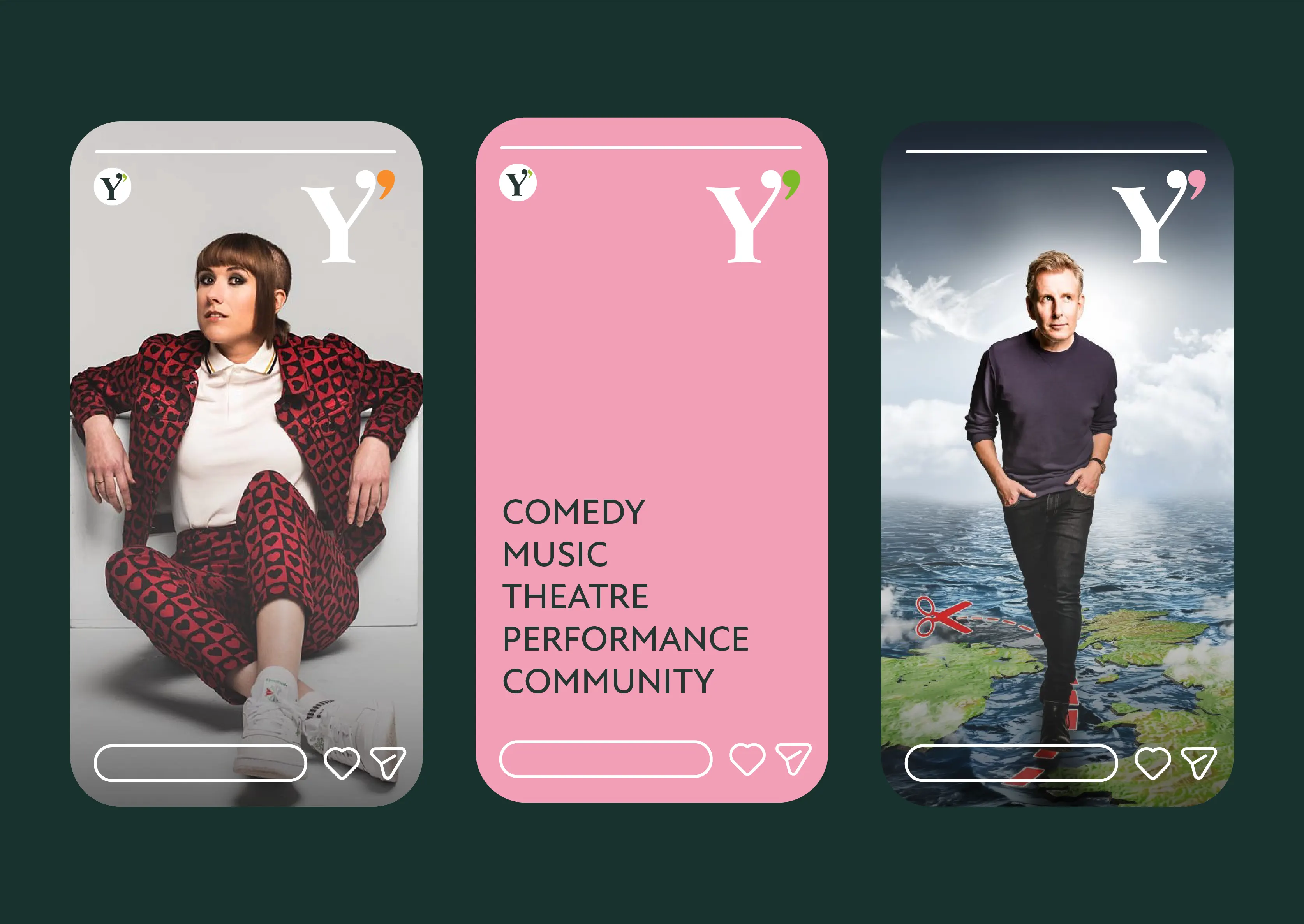
While bright green is the hue of choice for the main logo, the scheme is eclectic enough to support multiple variations. Drawing on a vibrant, modern palette that adds soft pink, warm orange and tan brown to the mix. This gives the team flexibility to adapt the look and feel depending on the type of performance, dialling the energy up or down as needed.

OPTIMISED FOR DIGITAL
By dropping the word ‘Theatre’, ‘The Y’ can also function as a secondary logo. Used on its own, the ‘Y’ becomes a bold, simple shorthand – ideal for smaller formats such as social media icons and digital applications.


The journey of rebranding The Y Theatre with STB has been incredible. We felt it was a daunting task to create a separate but synergistic brand alongside YMCA, but STB tapped into the heritage of our Victorian building as well as our need to reflect modern theatre going audiences. They pushed through several different concepts and really listened to our feedback to exceed our expectations and create a brand that’s unique to our theatre.
Emma Knight, Fundraising and Communications Manager, YMCA