MATTIOLI WOODS
A clever brand for a smart new app
Mattioli Woods is a leading wealth management company who were keen to connect with customers at the start of their investment journey. They brought us on board to help brand and launch a new investment app to make it easier for people to get started.
What we delivered
— Naming
— Campaign
— Brand Identity
— Social Media
— App Design
— Guidelines
Smart Thinking
Lowering the barriers to investing, making it feel approachable and achievable for a new generation of investors.
Bold Design
Elegant and considered to inspire trust, with just enough warmth and personality to keep the experience human.
FULL SERVICE CREATIVE
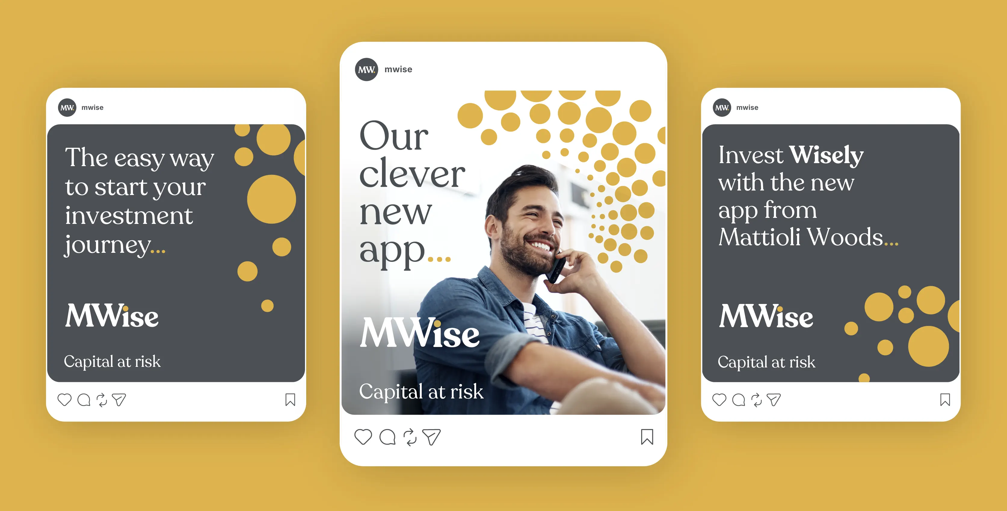
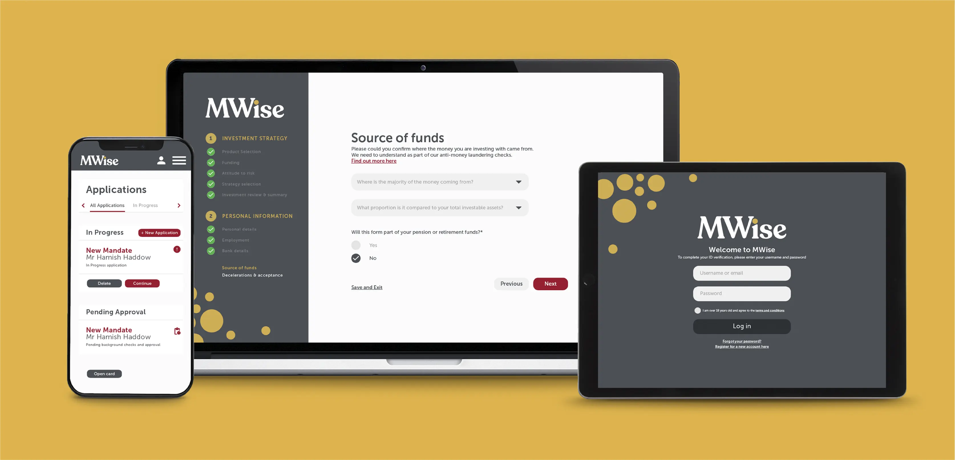
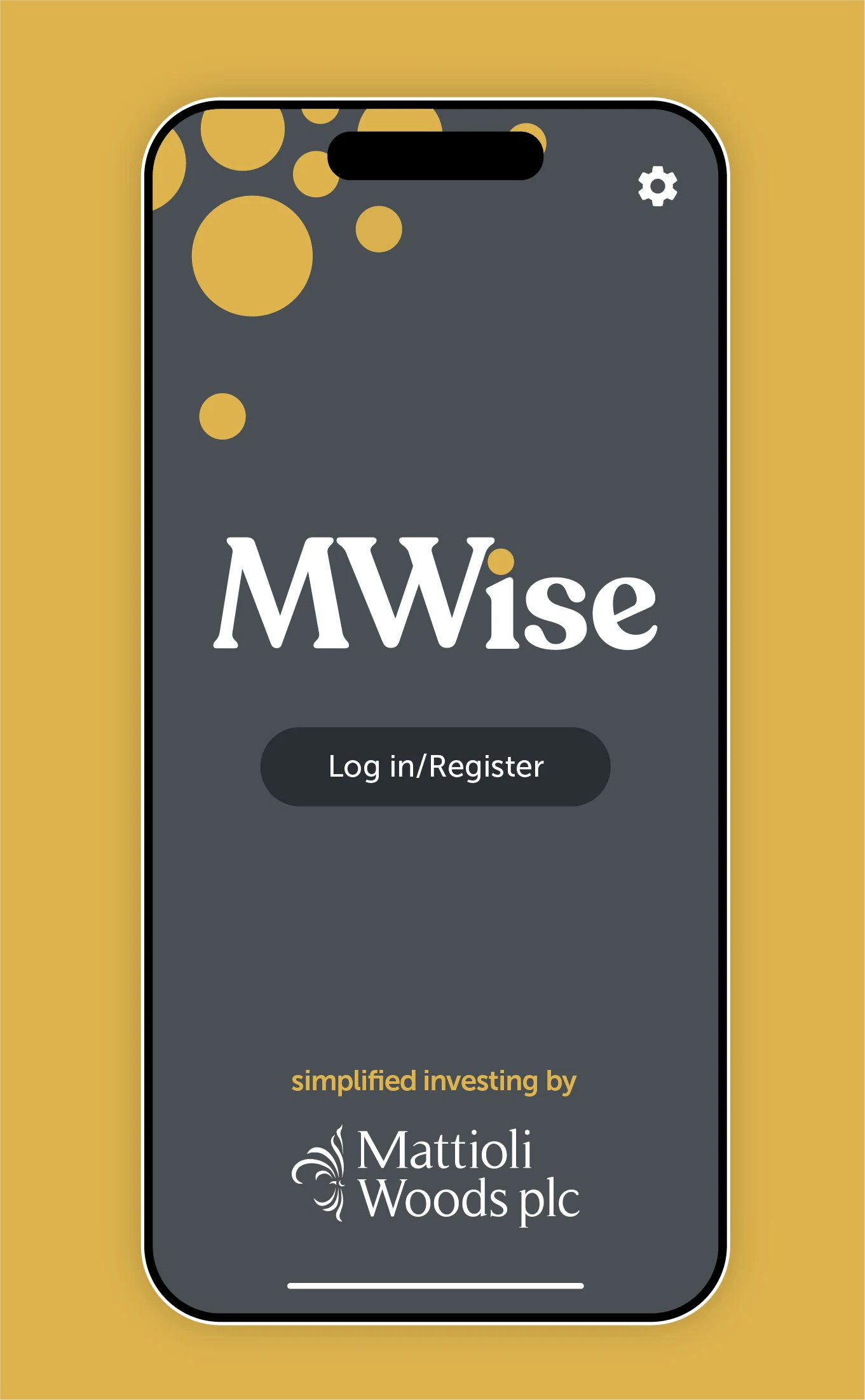
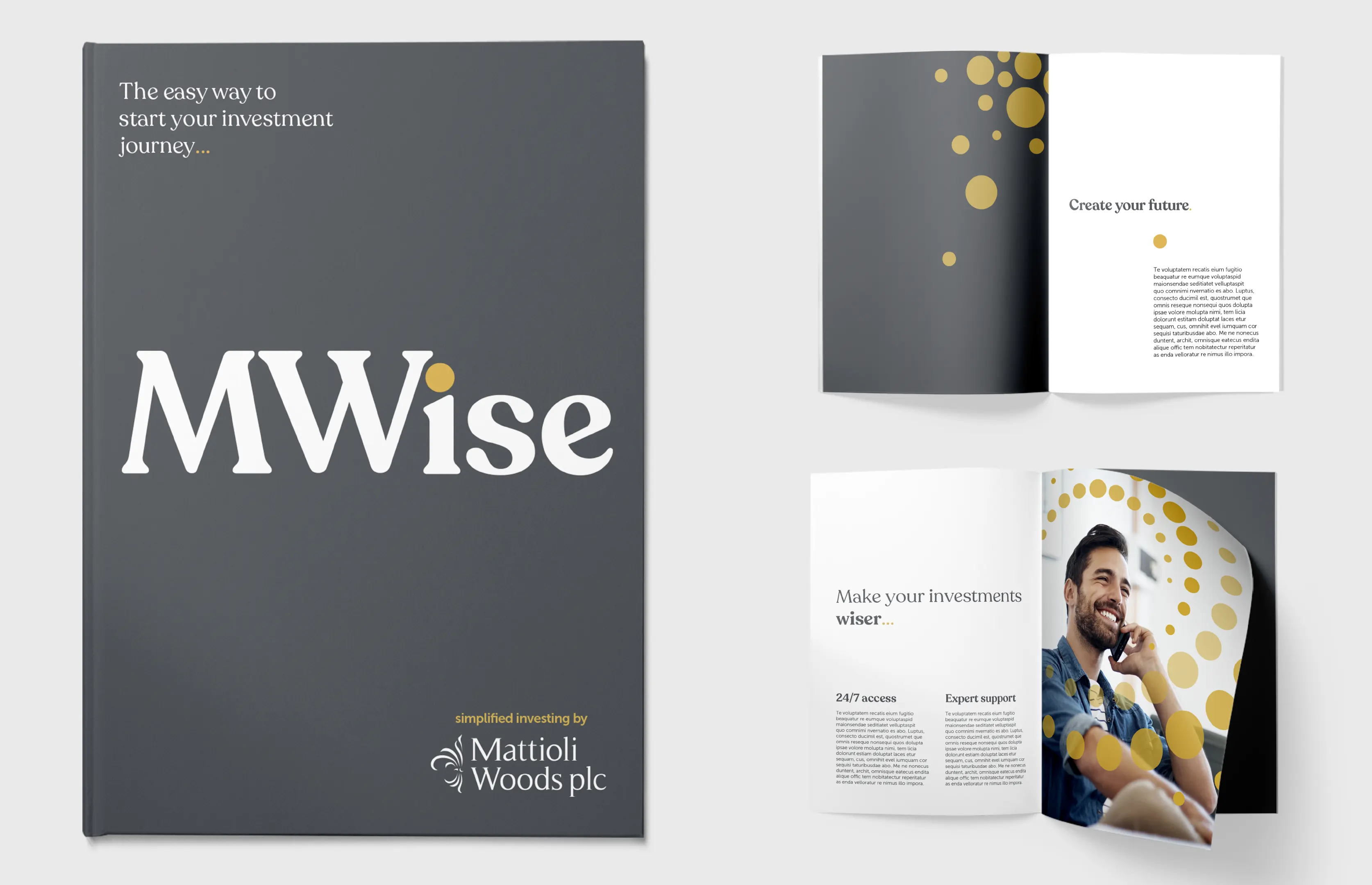
The project played to all our strengths, spanning strategy, naming, consumer research, prototyping and testing. After several rounds of creative exploration, we landed on MWise as the brand name – it reflected the company’s core values of knowledge and experience, while still feeling approachable for first-time investors.


THE HUMAN TOUCH
While easy and convenient, the MWise app is not fully automated – it’s supported behind-the-scenes by the human expertise of the Mattioli Woods team. This personal touch comes through in the brand’s tone of voice: honest, clear and concise, but with just enough personality to add warmth and trust.
A SYSTEM FOR GROWTH
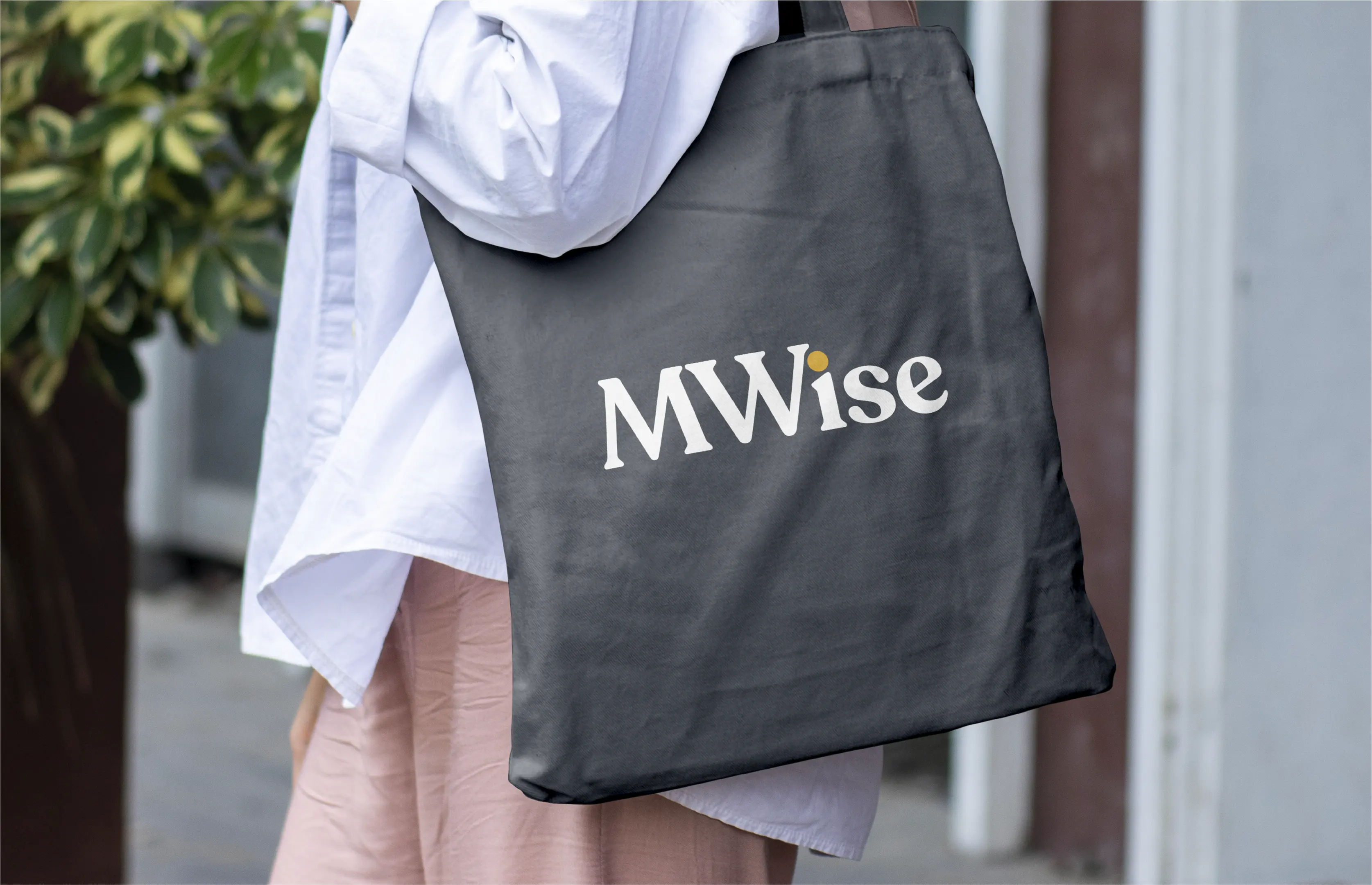
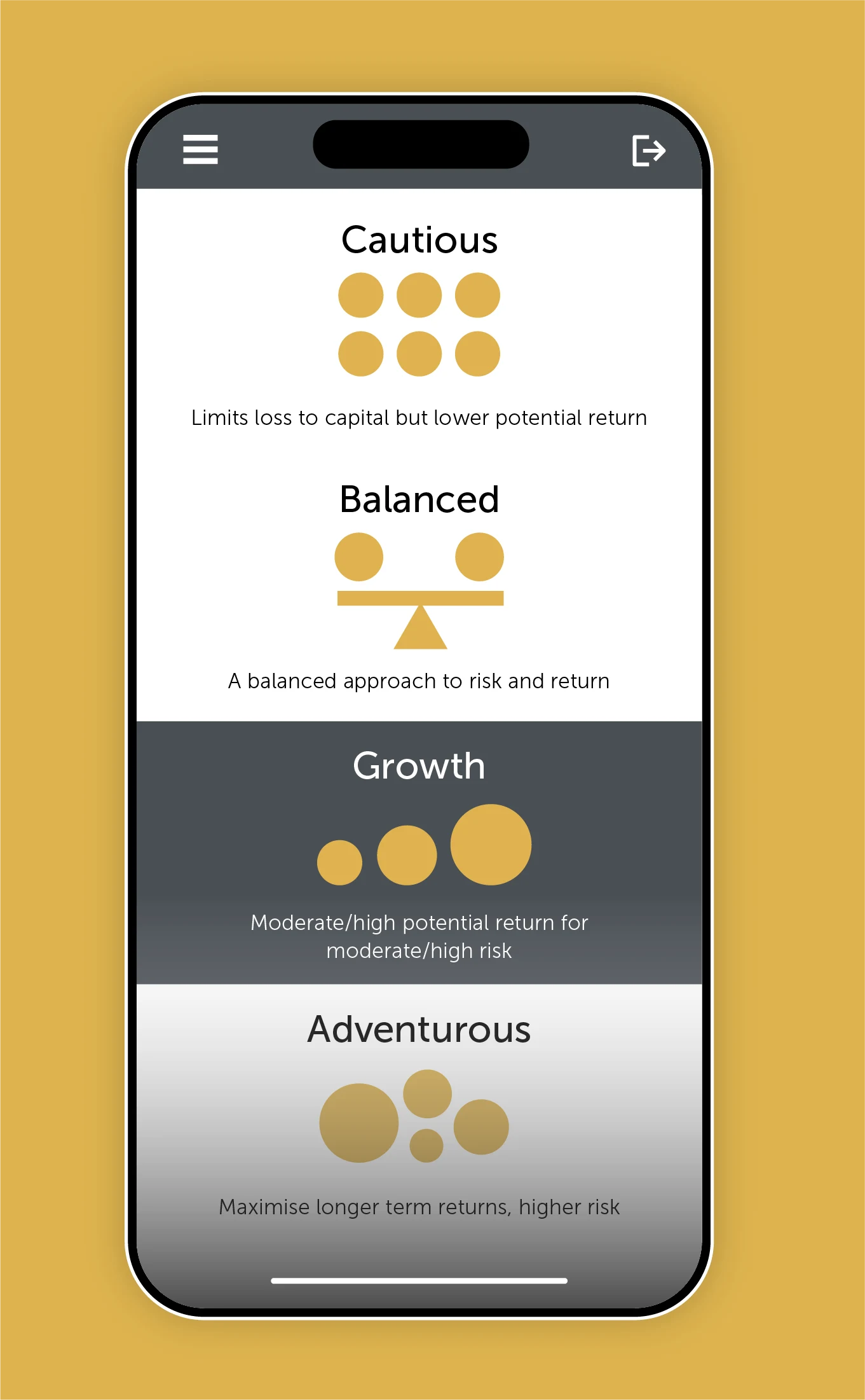
Building from the logo, one of the brand’s key visual components is a system of dots. Using the same gold accent colour as the tittle on the ‘i’, it can grow and expand, starting small but then building across different applications to symbolise growth. The dots come to life in various ways: as custom icons, punctuation in copy and as overlaid patterns for photography.
LIFE’S BIG MOMENTS
Featuring target customers at different milestones of their lives, the MWise brand imagery is positive, inspirational and future-focused with bright skies and yellow details that complement the gold accent.